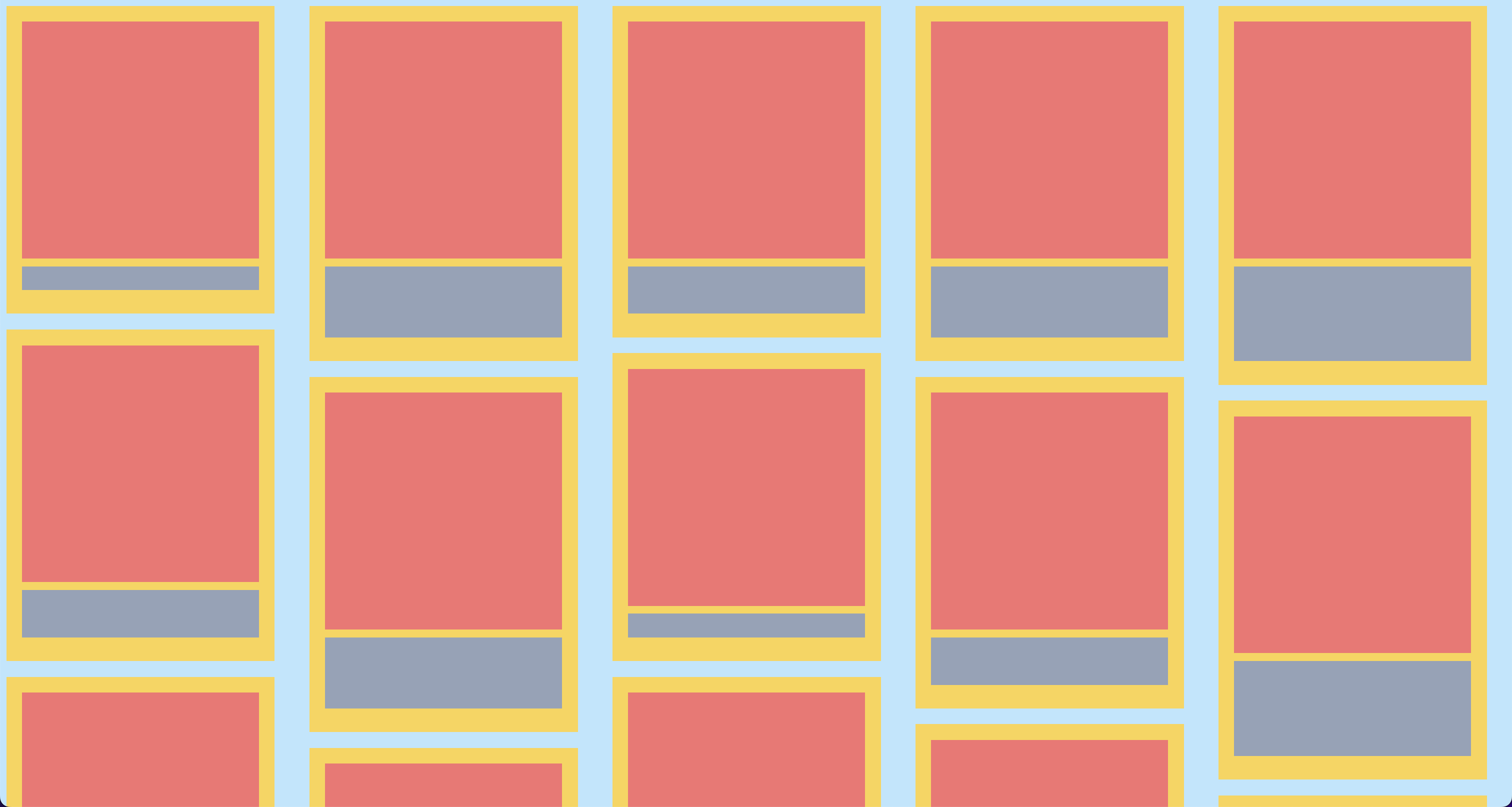
Masonry grid layout

No

TP

🚩
77

No
You might know this as the Pinterest layout. It’s a way to use a grid layout where elements on one axis (usually the vertical) can move to fill in gaps. Something like this:

You can implement this effect with a single line of CSS:
grid-template-rows: masonry;
If your browser supports it, you can see it in action below: